
Sep 10, 2019 in Business Coaching
User Experience Design and its Design Principles
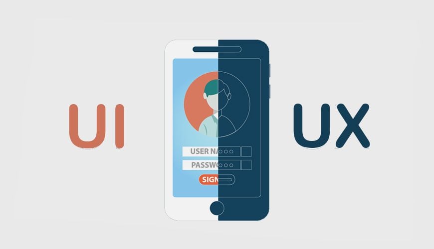
What are UX design principles? UX stands for User Experience. This term originated a couple of years ago, even though something that seems basic and completely necessary, the tech industry has been talking about it somewhat loosely and often misunderstoo
It's your turn now! Let's support each other by clicking "Helpful".
+1
DISCUSS #Relationship


DISCUSS #Parenting


What are UX design principles?
UX stands for User Experience. This term originated a couple of years ago, even though something that seems basic and completely necessary, the tech industry has been talking about it somewhat loosely and often misunderstood. Being that, we want to highlight what user experience actually is.
What is the User Experience?
UX is understood as the work that is done to improve a product / service and that is functional, which will provide the user with a good experience when using it.
To go to the real root of what UX is we need to go back to the Industrial Revolution and the technological advances of the nineteenth and twentieth century, when businessmen saw ways to improve their work processes to optimize production time. Having that clear, let’s move on with the items below.
Top User Experience Principles
Make it ‘Digestible’
UX design has to be easy to digest in plain sight and prevent the user from having to spend hundreds of neurons in understanding what it is that they are looking at. When making decisions and executing actions, we need elements that guide us. Organize the information with a certain hierarchy using size, color and icons to highlight what is a priority and guide the user to find what they are looking for more easily.
In certain cases, it may be useful to include a site map in the footer that clarifies how the sections of the site are built for easy navigation.
Clarity Above All
Good UX design is honest. That is, it is decipherable for those who visualize it. Explain things to your visitors as they want you to explain them. Do not use complex terminology, speak your language and in the more sensitive sections such as prices and rates, get to the point.
A user will not click on a ‘buy now’ button if you do not tell them how much they are going to pay and what they will receive for it. Avoid the ‘free trials’ or deceptive demos that are going to take the user to go through a payment gateway, ‘wasn’t it free? ‘ -they will think.
Design Trust
Before asking a user to complete an action, we must gain it. In a website, the way to do it is by offering concrete explanations step by step, directing it towards an agile and simple conversion within our pages.
Let’s think about how Uber has done it, which has completely revolutionized an entire industry through a user-friendly app that stores the user’s billing information (data that the user would not feel comfortable sharing with a stranger) and facilitates the payment and transactions in the friendliest way possible.
A Familiar Appearance
It is normal that for designers to like to innovate by presenting elements and combining patterns. Still, web usability requires some consistency in the form so that the user recognizes what he is seeing.
The aesthetic layouts and the appearance of platforms such as that of Google provide clues on how to design styles and icons to get to avoid friction and generating confusion during an interaction.
Articles that helped others